Impact Points: a screen time score that knows not all hours are equal

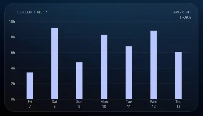
Screen time measures one thing: how long you looked at a screen. The flaw is that it says nothing about what that time consisted of. Looking at a daily total, you cannot tell eight hours of writing code from eight hours of Netflix. Both report the same number.
Impact Points fix this. Every app and website gets a score from 0 to 1000 points per hour based on how stimulating it is. The higher the score, the more harmful we consider it. Adult content, gambling and short-form video score high. Effortful, low-stimulation work scores low. Lower is better.
This page explains how Impact Points work, where the numbers come from, what a good score looks like, and how to override the whole system when you disagree with us.
Available on Windows and Mac
Why raw screen time is a bad metric
Screen time treats all usage as equal, so it punishes the wrong things. A day of focused work on a computer can log ten hours and be perfectly healthy. Ninety minutes of short-form video before bed logs almost nothing and does real damage. A minutes-only number cannot see the difference.
The best evidence for this is a study usually cited to argue the opposite. In 2019, Orben and Przybylski ran a specification curve analysis across three large datasets covering 355,358 people and found that total technology use explains at most 0.4 percent of the variation in adolescent wellbeing, an effect the coverage compared to eating potatoes. That result gets read as "screens are fine." The better reading is that the measure is too blunt to detect anything. Aggregate hours are the wrong unit.
Look at composition instead and the picture sharpens. A 2023 review in Addictive Behaviors traces one mechanism, reward variability, across gambling, gaming, shopping, social media and online pornography, and identifies infinite scroll and personalized recommendation as newer sources of the same variability. A 2026 systematic review covering 42 studies and nearly 47,000 young people looked specifically at short-form video interfaces, isolated from other media, and found the delivery format itself associated with worse attention and self-regulation outcomes.
Not everything here is settled. The popular claim that passive scrolling harms wellbeing while active posting helps it, which comes out of Verduyn's work, has been challenged hard since 2022 and the authors themselves have since revised it to depend on context. We are not going to pretend that one is nailed down.
What holds up is the direction. Variable-reward, high-novelty, infinite-feed products behave differently from linear content, which behaves differently from tools. Nearly every tracker on the market still hands you one undifferentiated hour count.
How Impact Points work
Every app and website has an hourly score from 0 to 1000. Time on it accrues points at that rate.
Something scored at 400, used for half an hour, adds 200 points to your day. Something scored at 20, used for eight hours, adds 160. That is the entire mechanic. The points climb fast on things designed to capture you and barely move on things you chose to do.
The web has millions of sites and there is no world where we score all of them. Anything not in our system defaults to 20 points per hour, the rate for ordinary low-stimulation software: your editor, your spreadsheet, your terminal. If something you consider harmful is landing on the default, email us or set your own score for it.
How we score apps and sites
| Category | Points per hour |
|---|---|
| Pornography | 1000 |
| Gambling | 900 |
| Short-form video (TikTok, Reels) | 500 |
| Games and dating | 400 |
| Social media | 400 |
| Messaging | 200 |
| Streaming (Netflix, YouTube, Twitch) | 150 |
| News | 100 |
| Shopping | 80 |
| Everything else | 20 |
The top of the table is where we take a position. Pornography, gambling and short-form video are built on variable reward and novelty, they are the three categories our users most often say they lost years to, and they are the ones with the clearest mechanism behind them. We are not neutral about them and the numbers say so. Everything below social media is priced closer to ordinary use, because most of it is ordinary use.
Where the numbers come from, honestly
There is no laboratory study that says TikTok is exactly 500, or that gambling is precisely 1.8 times worse than social media. Anyone claiming otherwise is selling something.
What the research supports is the ordering, not the magnitudes. Variable-reward, high-novelty, infinite-feed products are consistently more compulsive than linear content, and linear content is more compulsive than tools. That ranking is defensible and the citations above are where it comes from. The specific numbers are our attempt to put honest proportions on it, calibrated by testing the ordering against multiple independent models and applying our own judgment where they disagreed. It is a considered estimate, not a measurement, and we would rather say that plainly than dress it up.
The scale is open for revision. If you think a category is mispriced and you can argue it, tell us and we will look at it.
When you disagree, re-score it
Click any app or website in Analytics and you get a slider. Set any value from 0 to 1000 and your score replaces ours everywhere in the product.
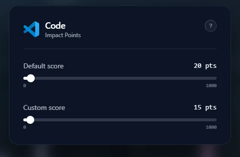
Our defaults describe the average person, and you are not the average person. News might be your real problem while social media is genuinely social for you. A particular game might be background noise for one person and a compulsion for another. You can also flatten every score to a single default value and build your own system from scratch.
What a good score looks like
As a daily average: under 500 is green, 500 to 1500 is yellow, 1500 and above is red.
| Day | What it was made of | Points | Status |
|---|---|---|---|
| Office day | 8h productive software (8 × 20) | 160 | Green |
| Mixed day | 2h gaming (800) + 1h YouTube (150) + 3h deep work (60) | 1010 | Yellow |
| Gaming day | 8h gaming (8 × 400) | 3200 | Red |
One rule matters more than the thresholds: watch the trend, not the day. Everyone has days that run red. A single number tells you almost nothing. The weekly and monthly lines tell you what your habits actually are.
Note that points are a total, not a rate, so a fourteen hour workday carries a higher floor than a four hour one. That is deliberate. Time spent is real regardless of what it was spent on, and dividing it away lets a heavy user hide a heavy habit. Compare yourself to your own previous weeks, not to someone else's total.
Reading your own numbers
Work from Analytics or from the weekly and monthly reports. What almost everyone finds is concentration: a small number of items generating most of the points. Two or three lines usually explain the whole chart.
That leaves you two options. Change the habit, or enforce it.
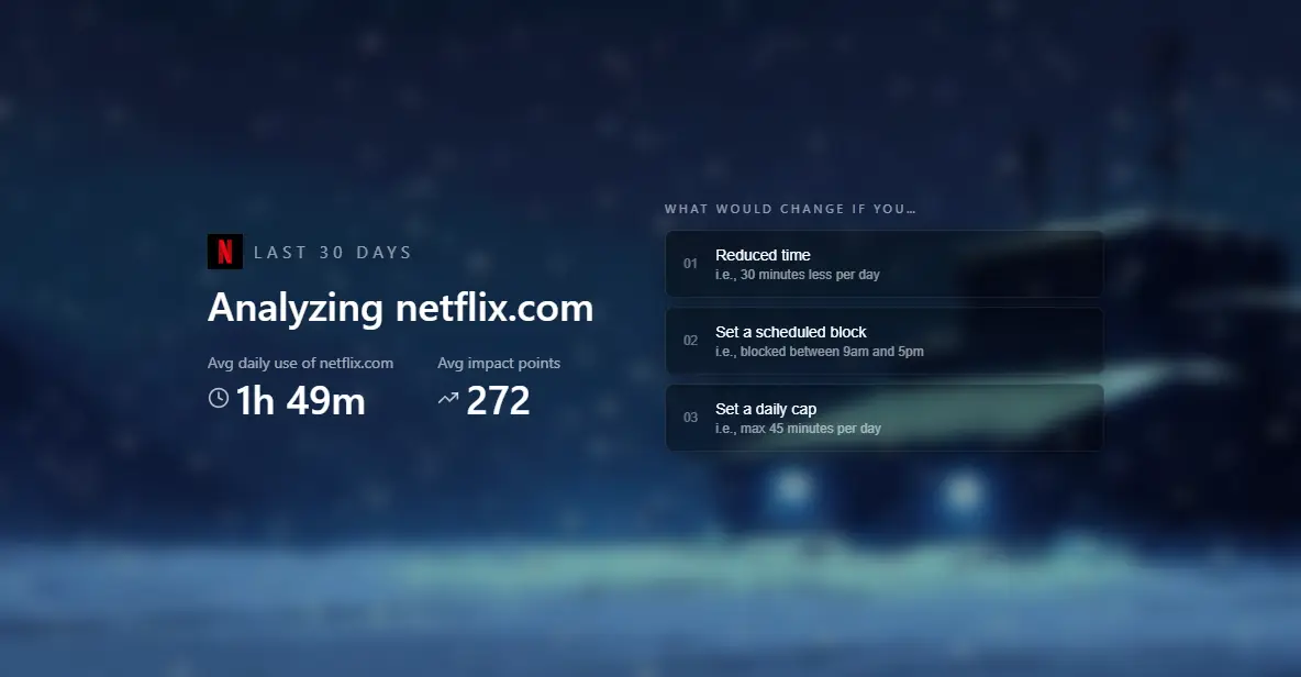
Before you decide, run it through Mountain Laboratory, the what-if simulator. Pick an item, apply a hypothetical block, and see what last month would have looked like without it. Seeing the counterfactual is usually the moment it stops being abstract. The blocks themselves and how hard they are to remove are covered here: website blocker that can't be uninstalled.
Frequently Asked questions
What is a good Impact Points score?
Under 500 as a daily average is green, 500 to 1500 is yellow, 1500 and above is red. Zero is not the goal. A flat or falling trend that matches what you intended is.
How is the score calculated?
Each app and website has a rate from 0 to 1000 points per hour. Time on it accrues points at that rate, and the day's total is the sum. Half an hour on something scored 400 costs 200 points.
Can I change the scores?
Yes. Every app and website accepts a custom value from 0 to 1000, which overrides ours. You can also reset everything to a flat default and build your own scale.
What happens to apps you have not scored?
They default to 20 points per hour, the rate for ordinary software. Email us anything you think is mispriced, or set it yourself.
Are YouTube Shorts scored separately from normal YouTube?
No. Scoring is per site, so all of YouTube is charged at 150 points per hour. If Shorts is the part you struggle with, raise YouTube's score yourself or block it outright.
Does a high score block anything automatically?
No. Impact Points are measurement only. Blocking is separate and always something you choose to set up.
How is this different from Windows' built-in screen time?
Built-in reporting gives you hours per app. It cannot tell you whether those hours were work or a slot machine. Impact Points score the content of the time, not just the length of it.
Sources
- Orben, A. and Przybylski, A. K. (2019). The association between adolescent well-being and digital technology use. Nature Human Behaviour 3, 173-182.
- Engineered highs: reward variability and frequency as potential prerequisites of behavioural addiction (2023). Addictive Behaviors.
- Taming the endless scroll? Short-form videos, digital routines and neurocognitive outcomes in youth (2026). European Child & Adolescent Psychiatry.
- Valkenburg, P. M., van Driel, I. I. and Beyens, I. (2022). The associations of active and passive social media use with well-being: a critical scoping review. New Media & Society 24(2), 530-549.